Framsteg förening
En webbplats för kulturföreningen
Overview
Framsteg Förening är en kulturförening som stödjer integration mellan nyanlända och svenska familjer genom att erbjuda viktiga resurser, tjänster och möjligheter till engagemang. Målet med projektet var att designa och utveckla en webbplats som ökar tillgängligheten, stärker gemenskapen och förenklar användarens interaktion.
Kundcase
Framsteg förening
När
Jan – Feb 2024
Vad
Hemsida & brand

Med fokus på integration
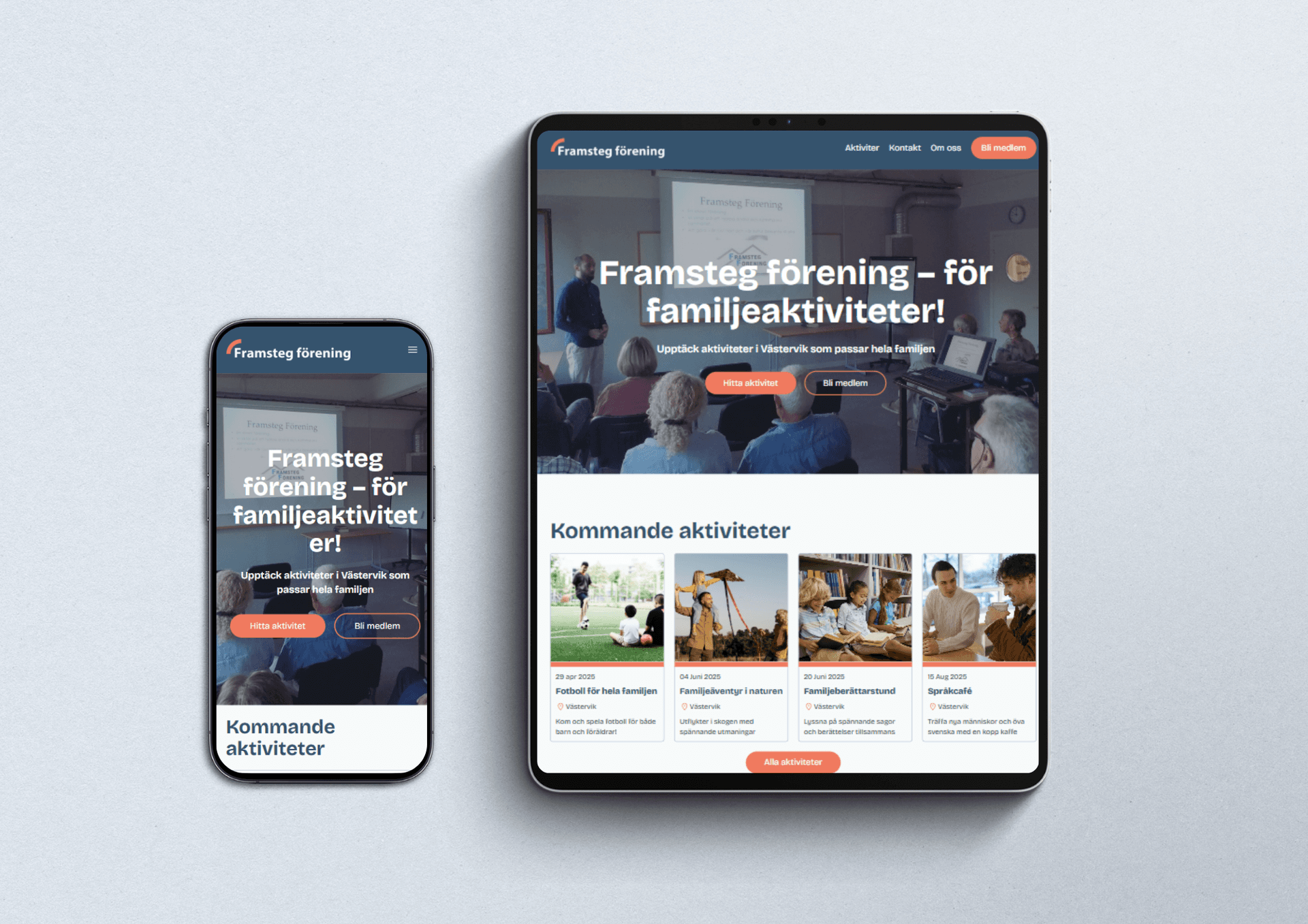
Framsteg Förenings webbplats är utformad för att smidigt informera besökare om kommande aktiviteter, ge viktig information om organisationen och skicka påminnelser i rätt tid till medlemmarna. Webbplatsen är byggd med tillgänglighet, responsivitet och optimal prestanda i fokus för att säkerställa en enkel och engagerande användarupplevelse.

Håll kontakten, håll dig informerad
Logotypens power
Logotypen fångar Framsteg Förenings kärna genom noggrant valda färger och former. Den böjda linjen symboliserar framsteg, samhörighet och gemensam utveckling, medan de varma och mångfaldiga färgerna speglar enhet och öppenhet. Den organiska formen förmedlar rörelse och energi, och lyfter fram föreningens uppdrag att skapa förändring och knyta människor samman över olika gemenskaper.


Brand guide
Framsteg Förenings varumärkesidentitet bygger på enkelhet, tillgänglighet, energi och konsekvens. Vi fokuserar på ren och funktionell design för att säkerställa tydlig kommunikation på alla plattformar. Tillgänglighet är centralt, med starka färgkontraster och läsbar typografi för alla användare. Konsekvens i färger och designelement stärker ett professionellt och enhetligt intryck. Vår accentfärg tillför energi och symboliserar framsteg samt engagemang i gemenskapen.
Responsiv design
Framsteg Förenings webbplats är byggd med responsiv design som anpassar sig efter alla skärmstorlekar, vilket säkerställer tillgänglighet för alla och enkel navigering på hela sidan.

Färdig produktdesign
